As it is highly experimental I am not displaying it for the degree show. I stated earlier, my work is two different chapters of the same book. This work is the sequel to that work.


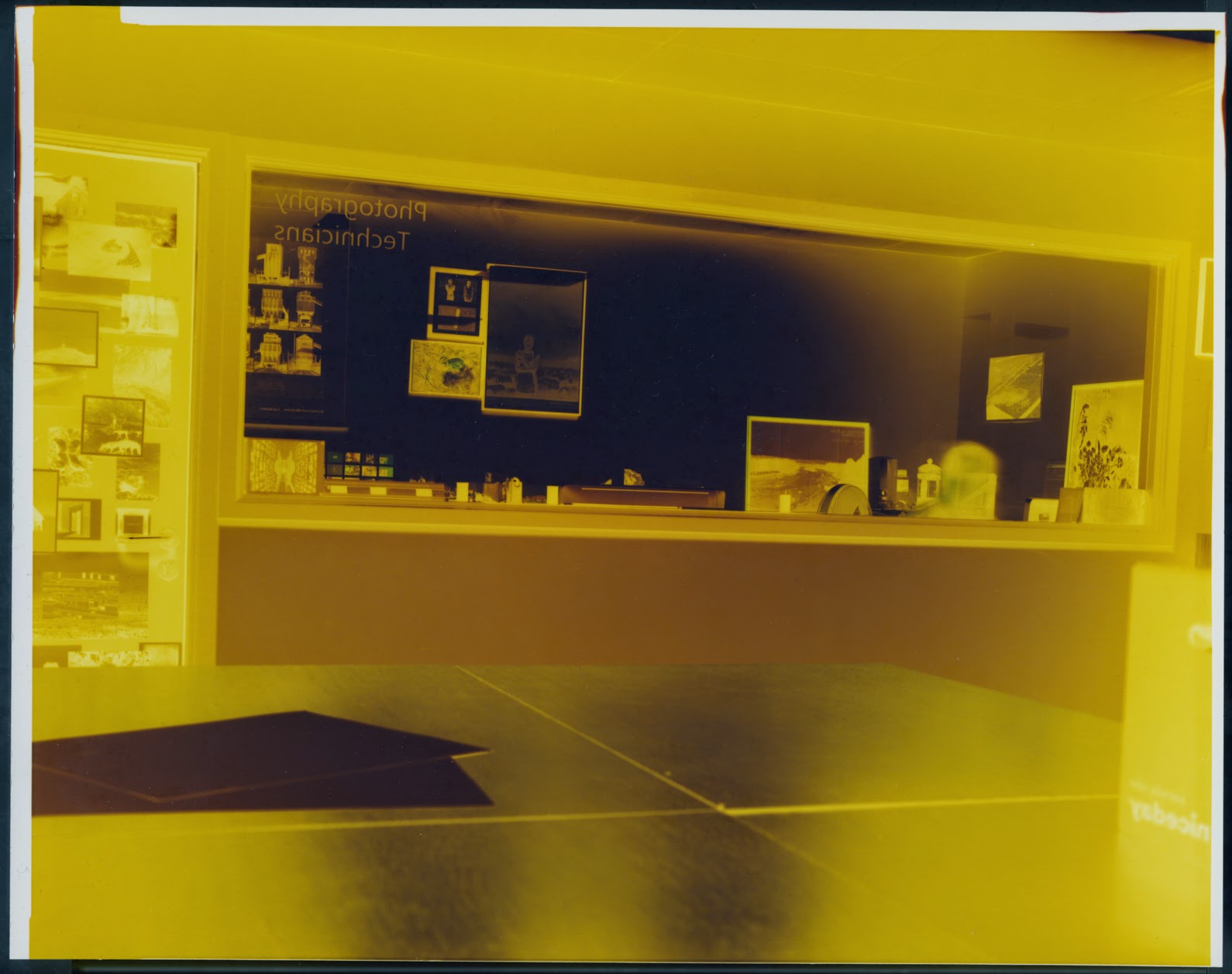
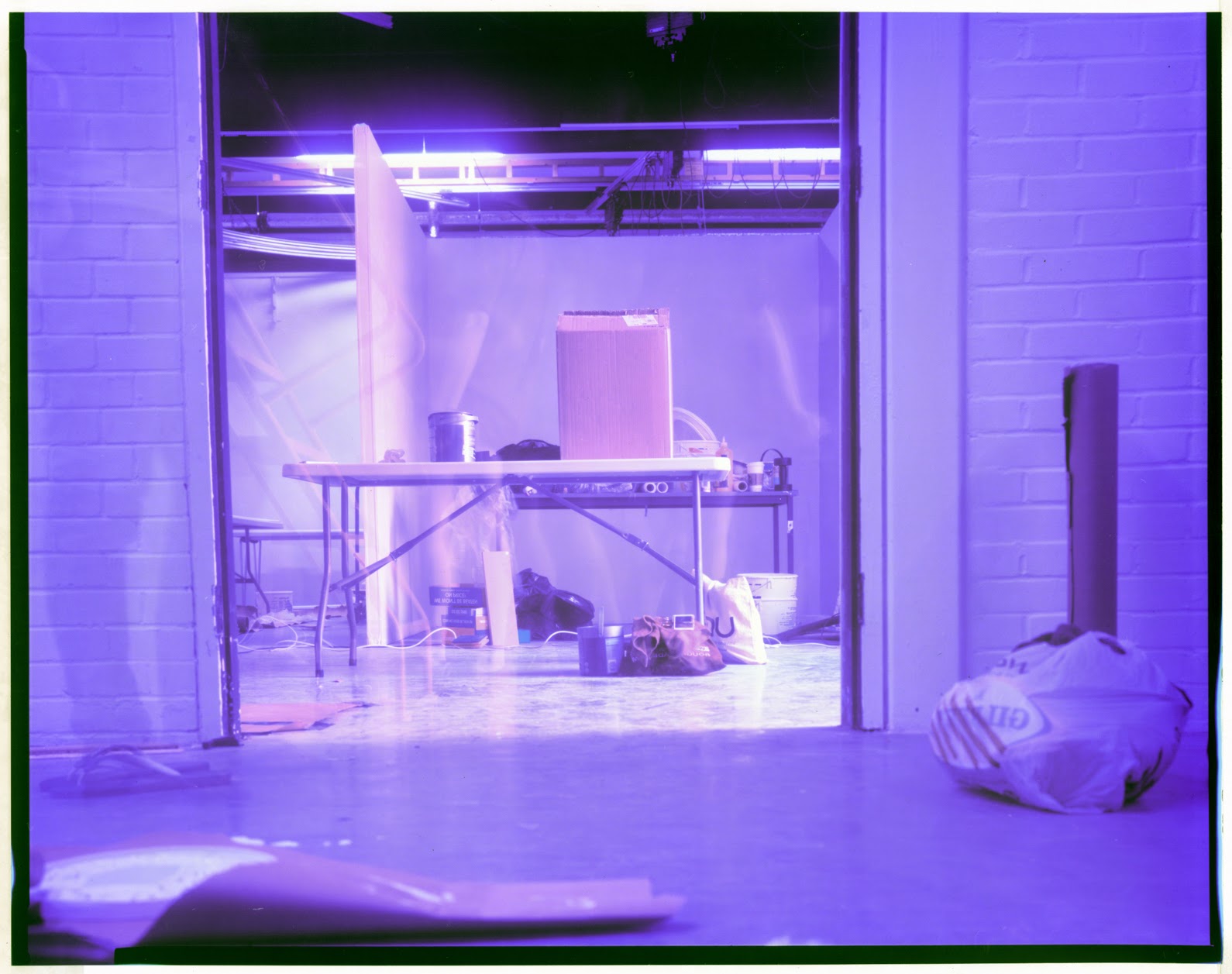
These are my original scans:


--------------------------------------------------------------------------------------------------------------------------


The colours are still quite basic and would need more work to get them to somewhere I might want to display them. However I feel that when the colours are inverted the photographs lose their strange nightmare feel.
--------------------------------------------------------------------------------------------------------------------------

While experimenting with colours I adjusted the midtones in the colour balance adjustment in Photoshop. this was pretty much the first thing that happened, Richard Mosse eat your heart out.


I retouched these as negatives to retain their nightmare aesthetic. I altered the colours in them though, so each had a strong colour dominating its composition, I think some work really well and accurately display my intentions, but others just dont fit, I feel the some of the series works better in its original negative colours.
No comments:
Post a Comment