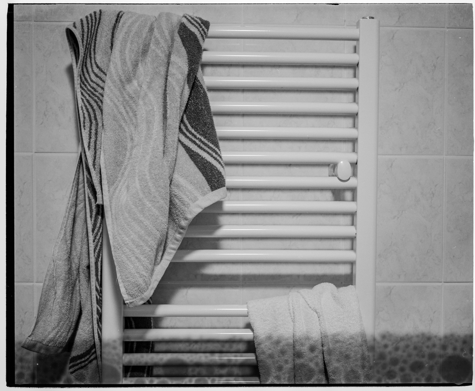
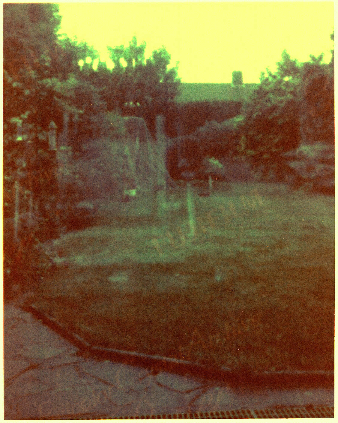
At this point in real time, I have started shooting with a 35mm film camera, so I cropped my pictures on 6x7 film to emulate this.
Showing posts with label development. Show all posts
Thursday, 19 November 2015
MA Photography - Time - Initial photographs
These are my initial photographs that I took in conjunction with my diary. I used a Mamiya 7, which created super sharp images. However these photos were difficult to take as I found the rangefinder focusing system hard to use, it was such a tiny rectangle in the middle of the screen, which made it difficult to use. I also made a mistake while processing the film, I think I used too little developer which created these bubbles at the bottom of my images. I used only 400ml of 1:1 dev and water.
MA Photography - Time - Colour Paper, further development
This picture is completely insane, the highlights, that are white, for example the bed and the self are correct, but all the shadows are purple, how insane!
In this picture the whites are okay, the the blue on the cup is close to correct, but the two curtains hanging down are bright orange in real life, it seems crazy that in most areas the colours are correct, but for the curtains the colour is practically inverted.
My theory is that most of the shot is exposed with incandescent light bulbs like that you have in your house, but the curtains have the sunlight coming through and have been captured completely different. Those as i remember, there wasn't a lot of light coming through the window, it was a very overcast day and it was late afternoon with the light fading.
Here it ca be seen my colour corrections are getting closer and closer, the very last photo, its nearly there, not too bad. but a lot of the scans, expecially from interiors, the colours are way off. I cant figure out why some colours in those pictures are close to what they should be, and others are horrendous.
MA Photography - Time - Colour paper, further development
When processing the scans these were some settings I used in the Flexcolour software to correct the colours and get the right levels. They are still way off though, better than my colour papers from April and May but still way off neutral.
MA Photography - Time - Colour Papers Development
I used several blue and cyan filters over the lens, to filter out the blue light and some green light.
These are scans of some of my paper negatives. I took several exposures of each scene, with different filters, these were the most successful I felt.
This is my camera set up:
A wooden 5x4 camera with a Schneider lens
MA Photography - Time - Colour Paper, Fujifilm Crystal Archive
http://www.fujifilm.eu/uploads/tx_ffproducts/files/files/Fujicolor_Crystal_Archive_Paper_2015_01.pdf
To continue working in colour I found this pdf from fujifilms website, about the properties of the paper, to be honest I didn't understand most of it, but the bit that interested me, about the different colour sensitivities to light were these bits:
What they mean, as far as is in my understanding is that the blue and green in the paper are more sensitive to light than red is, I am not sure that the difference in wavelength has an effect on the image. If I managed to find a number of filters that would bring the exposure of blue and green in line with red, whether this difference in wavelength would have an effect.
To continue working in colour I found this pdf from fujifilms website, about the properties of the paper, to be honest I didn't understand most of it, but the bit that interested me, about the different colour sensitivities to light were these bits:
What they mean, as far as is in my understanding is that the blue and green in the paper are more sensitive to light than red is, I am not sure that the difference in wavelength has an effect on the image. If I managed to find a number of filters that would bring the exposure of blue and green in line with red, whether this difference in wavelength would have an effect.
Sunday, 26 April 2015
The Editing Process
I spent a day editing through my images to decide which ones to display, and how to display them. I edited through my prints so it was easy to move them around and see how they would play out on a wall.
I took a while to get a grid that I was happy with.
I liaised with Ellen Nolan for a large amount of wall space. I was considering displaying the A0 print I had, though I really wanted to save it for the Free Range exhibition as it takes up considerable wall space.
In reviews people say they see my 10x8s as part of a different series. I see them maybe part of a different chapter, but they are definitely pat of the same book. I went through those prints for a connecting edit too.
I liaised with Ellen Nolan for a large amount of wall space. I was considering displaying the A0 print I had, though I really wanted to save it for the Free Range exhibition as it takes up considerable wall space.
In reviews people say they see my 10x8s as part of a different series. I see them maybe part of a different chapter, but they are definitely pat of the same book. I went through those prints for a connecting edit too.
I like this edit, with the silver river leading into the heavens, and the path of it repeated in the print at the bottom with the path going through it. People who know the areas have commented on their strange aesthetic, they are backwards! Usually with film emulsion the photograph is viewable on both sides of the film, but with paper, it can only be viewed on one side, so the photographs are backwards. The sky swirls with an ethereal light; the ground is dark, oppressive, angry, aggressive. When I edit, I chose to have things different, I could have put the images with the ground at the bottom, the rivers in the middle, the sky at the top, but the series is representative of a dream, a dystopia, so it needed to be mixed up, adding to the unease of the 'chapter'.
Printing A0
Recently I have been printing some A2 size prints of my 10x8 captures. Originally I intended to display them as their negatives on the wall, they are just so nice, but after printing my 5x4s at A3 size to show in tutorials, I really liked having these prints to hold and show. Its so much nicer to have a print in your hands than a representation on a screen. Seeing the size difference again made me think of printing big. I thought for a week about it, and I decided to take the plunge. The work needs to be as big as possible, to have the effect. Shooting on 10x8 demands consideration, when you take a photograph on 10x8 so much work and setting up as gone into the process that it is highly considered. These shots cannot be merely walked by, when for example you are using an SLR, you walk around and snap at so many things, when using such large format everything is methodically thought through. These photographs cannot merely be walked past, so the Print needs to be large, to demand attention.
I chose the image I wanted carefully, as I cant simply print another if it does not work out well. I even had to rescan the negative to ensure I had enough resolution, just to be methodical. I went over the image from the start. Again I left in the problems of the scan process, and paid attention to the development process so the strange effects came through. I rotated the image to make things simpler when printing onto the 'roll paper', which was big enough to fit a A1 across, or an A0 lengthwise.
I methodically went through the print settings, 16-bit output, Super Fine Detail, unclick high-speed, all through the paper options.
I printed a test strip, of approximately 3 inches to check the print, check the sharpness, the tones, the resolution. All was great so I decided to proceed. It took around an hour and a half to finish printing. When It was finished I noticed quickly there was several inches missing from the other side of the print.
I had to come back the next day to do another print. I guess there was no definitive way of knowing the roll was nearly done, it sure looked like there was a fair amount of paper left. If I had not printed the test strip it would have printed the whole image, but I am still glad I did the test print, because I can imagine if I printed the whole thing before checking and one little thing that I might have overlooked could have ruined the whole print. The next day when I printed everything went without a hitch. Again II went through all the settings, though they hadn't changed since the previous day.
I chose the image I wanted carefully, as I cant simply print another if it does not work out well. I even had to rescan the negative to ensure I had enough resolution, just to be methodical. I went over the image from the start. Again I left in the problems of the scan process, and paid attention to the development process so the strange effects came through. I rotated the image to make things simpler when printing onto the 'roll paper', which was big enough to fit a A1 across, or an A0 lengthwise.
I methodically went through the print settings, 16-bit output, Super Fine Detail, unclick high-speed, all through the paper options.
I printed a test strip, of approximately 3 inches to check the print, check the sharpness, the tones, the resolution. All was great so I decided to proceed. It took around an hour and a half to finish printing. When It was finished I noticed quickly there was several inches missing from the other side of the print.
I had to come back the next day to do another print. I guess there was no definitive way of knowing the roll was nearly done, it sure looked like there was a fair amount of paper left. If I had not printed the test strip it would have printed the whole image, but I am still glad I did the test print, because I can imagine if I printed the whole thing before checking and one little thing that I might have overlooked could have ruined the whole print. The next day when I printed everything went without a hitch. Again II went through all the settings, though they hadn't changed since the previous day.
Subscribe to:
Posts (Atom)